
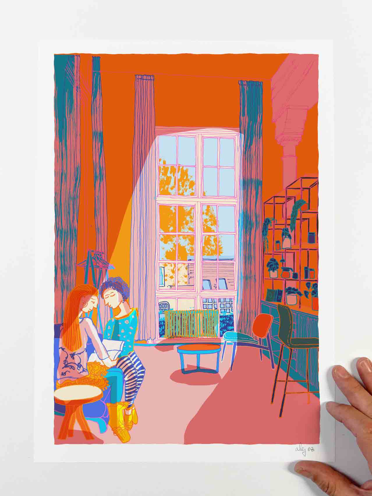
At the Temple Building by the Window Brighton Girls
Price range: £40.00 through £310.00
Description
At the Temple Building by the Window Brighton Girls
Print description
The theme might depict a first day at school—perhaps feeling a bit overwhelmed, encountering new experiences, then meeting another student, starting friendship, and gradually easing into the rhythm of things.
The Temple
Brighton Girls GDST home from 1980 ‘The Temple’ building was commissioned by Thomas Read Kemp in 1819 and designed by Amon Wilds. This beautiful building has seen many changes over the years and today is a wonderfully restored and contemporary hub for Brighton Girls.
The Temple was built in 1819. Very likely Amon Wilds designed it for Thomas Read Kemp. The Building had originally a square plan with 5 bays on each side, and 2-storeyed with the domed upper storey. It became a boys’ school in 1828; the present first floor on the original building dates from before 1876; the wing to the south-west corner was added, as the inscription records, for the Girls Public Day School Company in 1891.
Only the east and north sides of the building retain the beautiful original ground-floor treatment of 5 arcaded bays with flat-arched windows set back under a round-arched arcade with paired engaged columns which taper downwards and have Egyptian bud capitals of exaggerated form
According to Carder T: The Encyclopaedia of Brighton: Lewes: 1990- The Temple has been built on the exact measurements of Solomon’s Temple and so is called “The Temple”.
Print details
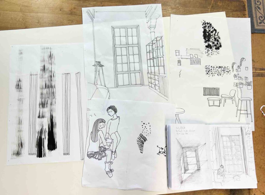
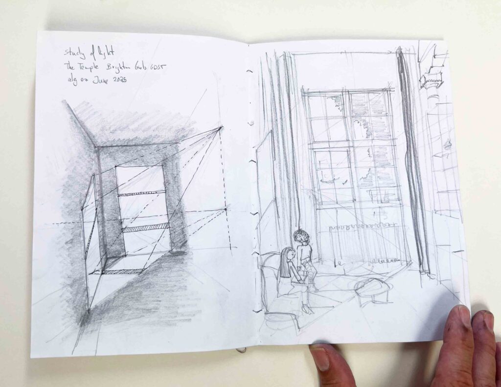
To create this print, I start by crafting individual drawings in ink, which collectively form a collage comprising the final piece. I scan my drawings and digitally add colour. The original design solely exists in digital format, and I print it using archival inks and paper. I then release my design as a limited edition print, available in standard ‘A’ sizes, ranging from A0 (84.1 cm x 118.9 cm) to A4 (21 x 29.7 cm).
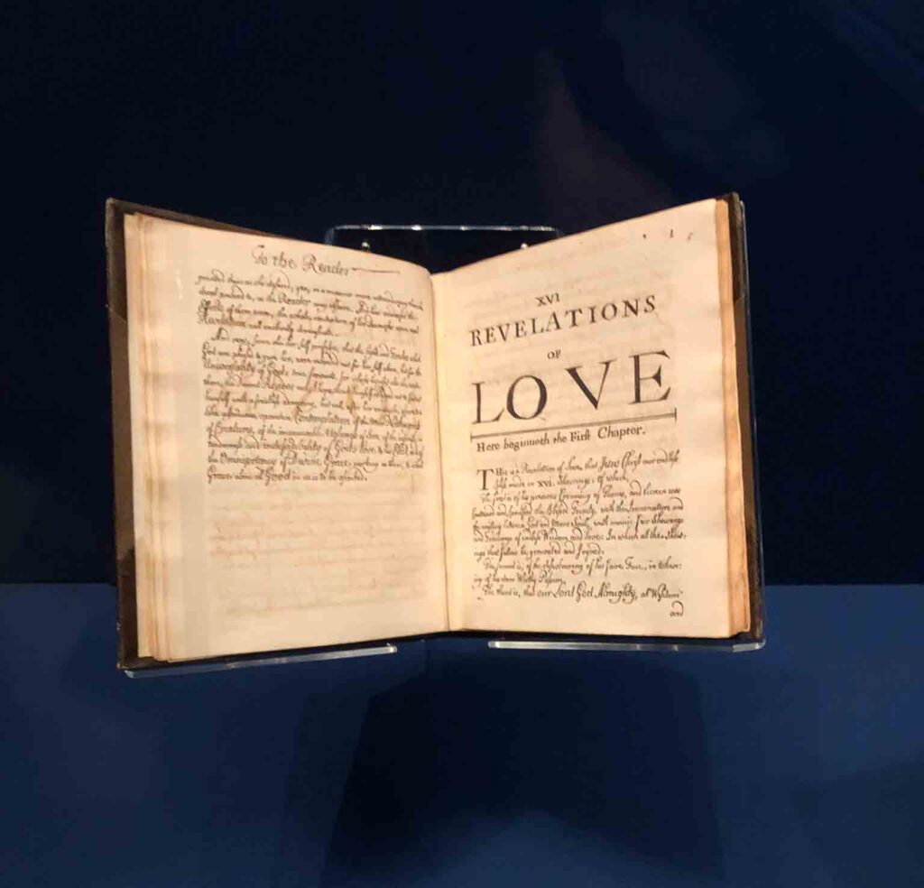
People and Places Revelations of Love
I love visiting the British Library. It regularly hosts different exhibitions, and in January 2025, I saw the show Medieval Women: In Their Own Words, which was fascinating. Among the exhibits was Julian of Norwich’s Revelations of Divine Love, circa 1675. I have borrowed this title to name my series of prints People and Places: Revelations of Love.
After recovering from her illness, Julian of Norwich chose to live as an anchoress—a woman who voluntarily isolated herself in a cell to dedicate her life to God. During her solitude, she meditated deeply on her spiritual visions. Many years later, she wrote a second version of her Revelations, known as the ‘Long Text,’ where she elaborated on the theological significance of these visions in much greater depth. This version has survived only through 17th-century copies made by English nuns in exile in Paris and Cambrai.
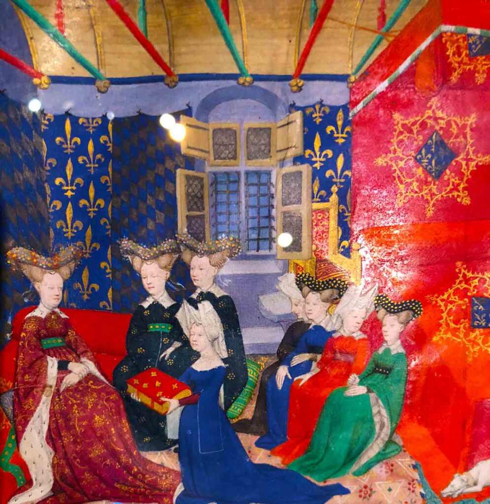
Another masterpiece I saw in this exhibition was a medieval book with an illustration titled Christine de Pisan with Queen Isabeau. Somehow, the vibrant colours of medieval books have also been a source of inspiration for this series
This work echoes many different sources, from Vuillard’s colourful depictions of the domestic patterned interior, many of which I saw at Pallant House Gallery in 2022, to the Alekos Fassianos Foundation, which I visited in Athens during the summer of 2023. Also in a mental periphery I can think of Ben Nicholson still lifes with his everyday objects; or Gwen John interiors, specially one exquisite painting ‘La chambre sur la cour’
The human figure in a scene
I have been running life drawing sessions in Brighton for many years, and the depiction of the human form fascinates me. Through this piece, I aim to express both my personal experiences and the environment where I live. So the inclusion of a figure is very important, referencing one of my living art heroes, artist Louis Fratino, with his modernist cubic contemporary classics. It also draws inspiration from a recent exhibition at Studio Voltaire in London, that featured a pairing of works by Beryl Cook and Tom of Finland, held in the summer of 2024
You might also like
Additional information
| Dimensions | N/A |
|---|---|
| Print sizes: standard portrait and square | A0 print size, portrait, A1 print size, portrait, A2 print size, portrait, A3 print size, portrait, A4 print size, portrait |